Shape Style
Drawlib uses ShapeStyle for styling shapes.
For a shape’s text, it uses ShapeTextStyle, which is similar to TextStyle but is a different type.
ShapeStyle
ShapeStyle is used for styling shapes. Additionally, shape alignment is configured within ShapeStyle.
Here are attributes of ShapeSyel.
haligh
valign
lwidth
lcolor
lstyle
fcolor
alpha
All of these attributes are optional. If you don’t specify values for them, the default theme values are applied.
Alignment
You can configure the alignment of shapes, except for arrow() and polygon(), which specify drawing points explicitly and therefore do not have alignment options.
The default alignment is centered both horizontally and vertically. Y
ou can specify "left", "center", or "right" for horizontal alignment (halign).
Similarly, you can specify "bottom", "center", or "top" for vertical alignment (valign).
For more details and examples, please refer to the Coordinate and Alignment page.
Style
ShapeStyle possesses styling attributes, categorized as follows:
Line style
Line style
Line and fill style
Currently, the fill style includes only the color attribute (fcolor), where f stands for fill.
The only attribute that applies to both line and fill is alpha.
Other attributes are for the shape’s line and start with l, which implies line.
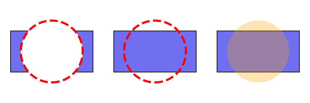
Here are three examples:
 1from drawlib.apis import *
 2
 3config(width=150, height=50)
 4
 5# left
 6rectangle(xy=(25, 25), width=40, height=20)
 7circle(
 8    xy=(25, 25),
 9    radius=15,
10    style=ShapeStyle(
11        lwidth=5,
12        lcolor=Colors.Red,
13        lstyle="dashed",
14        fcolor=Colors.White,
15    ),
16)
17
18# center
19rectangle(xy=(75, 25), width=40, height=20)
20circle(
21    xy=(75, 25),
22    radius=15,
23    style=ShapeStyle(
24        lwidth=5,
25        lcolor=Colors.Red,
26        lstyle="dashed",
27        fcolor=Colors.Transparent,
28    ),
29)
30
31# right
32rectangle(xy=(125, 25), width=40, height=20)
33circle(
34    xy=(125, 25),
35    radius=15,
36    style=ShapeStyle(
37        lwidth=0,
38        fcolor=Colors140.Orange,
39        alpha=0.3,
40    ),
41)
42save()
Left example has non transparent style. Center has fcolor transparent. Right has alpha value.
ShapeStyle
If you don’t need a shape border line, set lwidth=0.
If you don’t need a shape fill color, set fcolor=Colors.Transparent or fcolor=Colors.White.
These are typical shape styling configurations.
ShapeTextStyle
ShapeTextStyle is similar to TextStyle, which is used for drawing text with the text() function.
The differences between them are:
ShapeTextStyle: Allows shifting the x and y coordinates of the text from the center of the shape and changing the angle.TextStyle: Allows configuring the text background.
ShapeTextStyle has these attributes.
halign: Ignored (for future implementation)
valign: Ignored (for future implementation)
color: Text color
size: Text size
font: Text font
xy_shift: Shifting from the original drawing point
angle: Text angle (default is the same as the shape angle)
Here are three examples:
 1from drawlib.apis import *
 2
 3config(width=150, height=50)
 4
 5# left
 6rectangle(
 7    xy=(25, 25),
 8    width=40,
 9    height=20,
10    text="rectangle()",
11    textstyle=ShapeTextStyle(
12        color=Colors.White,
13        size=24,
14        font=FontSerif.COURIER_BOLD,
15    ),
16)
17
18
19# center
20rectangle(
21    xy=(75, 25),
22    width=40,
23    height=20,
24    angle=45,
25    text="rectangle()",
26    textstyle=ShapeTextStyle(
27        color=Colors.White,
28        size=24,
29        font=FontSansSerif.RALEWAYS_REGULAR,
30    ),
31)
32
33
34# right
35rectangle(
36    xy=(125, 25),
37    width=40,
38    height=20,
39    angle=45,
40    text="rectangle()",
41    textstyle=ShapeTextStyle(
42        color=Colors.White,
43        angle=0,
44        xy_shift=(-12, -3),
45    ),
46)
47
48save()
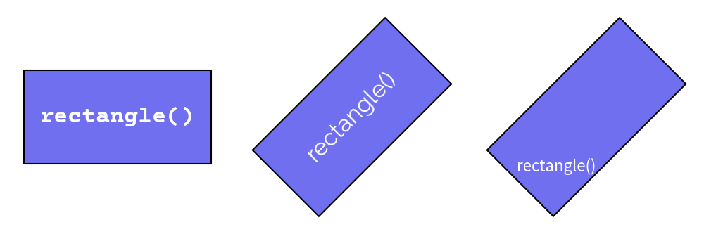
You can configure text styles. But also, you can configure text positioning which you can see right example.
Below is a figure illustrating these styles:
ShapeTextStyle
As you can see from the center text example, text normally follows the shape’s angle.
However, you can override it, as shown in the right example.
In that example, we also move the text positioning via xy_shift.
The x and y values are not absolute coordinates but are relative to the shape’s dimensions.
Theme’s Pre-defined Styles
Shapes can use pre-defined styles from the theme you choose.
The style syntax is: <color>_<type>_<weight>.
If the color, type, and weight are default, they are not shown in the style name.
Each style type has variations for line and fill styles with ShapeStyle.
ShapeTextStyle cannot use these styles.
default: Has border and fill color
flat: Has no bordersolid: Shape has an outline but no filldashed: Dashed outline, no fill
Each weight types has variation of line width except flat which doesn’t have line.
On ShapeTextStyle, it means tyep of fonts.
light: Half of the default line width; font is lightdefault: Regular line width; font is regular
bold: Double the default line width; font is bold
Here are three examples:
 1from drawlib.apis import *
 2
 3config(width=150, height=50)
 4
 5# left
 6circle(
 7    xy=(25, 25),
 8    radius=15,
 9    style="red_flat",
10    text="circle",
11    textstyle="white",
12)
13
14# center
15circle(
16    xy=(75, 25),
17    radius=15,
18    style="blue_solid",
19    text="circle",
20    textstyle="blue_bold",
21)
22
23# right
24circle(
25    xy=(125, 25),
26    radius=15,
27    style="green_dashed_light",
28    text="circle",
29    textstyle="green_light",
30)
31save()
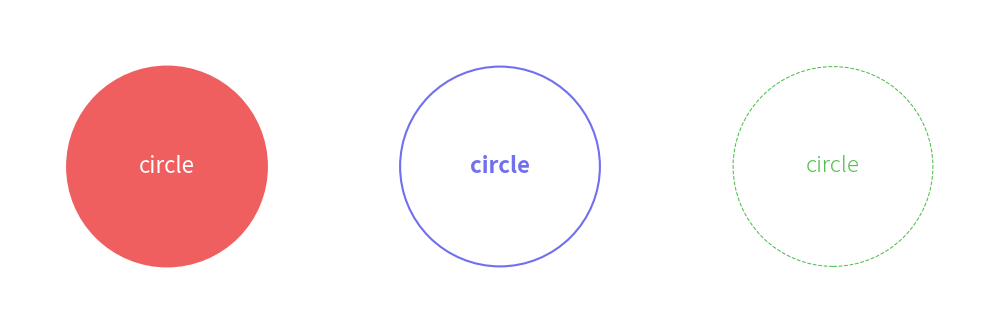
Below is a figure illustrating these styles:
Theme’s styles